Screener.in
Objective: To enhance Screener.in's user experience by improving usability, accessibility, and engagement, catering to both novice and seasoned investors.
Date
January 2020
Role
Art Direction, Web Design, Product Design
[ View Website ]
The Challenge
Complexity for New Users: The advanced features were overwhelming for beginners.
Limited Customization: Users couldn’t tailor the interface to their preferences.
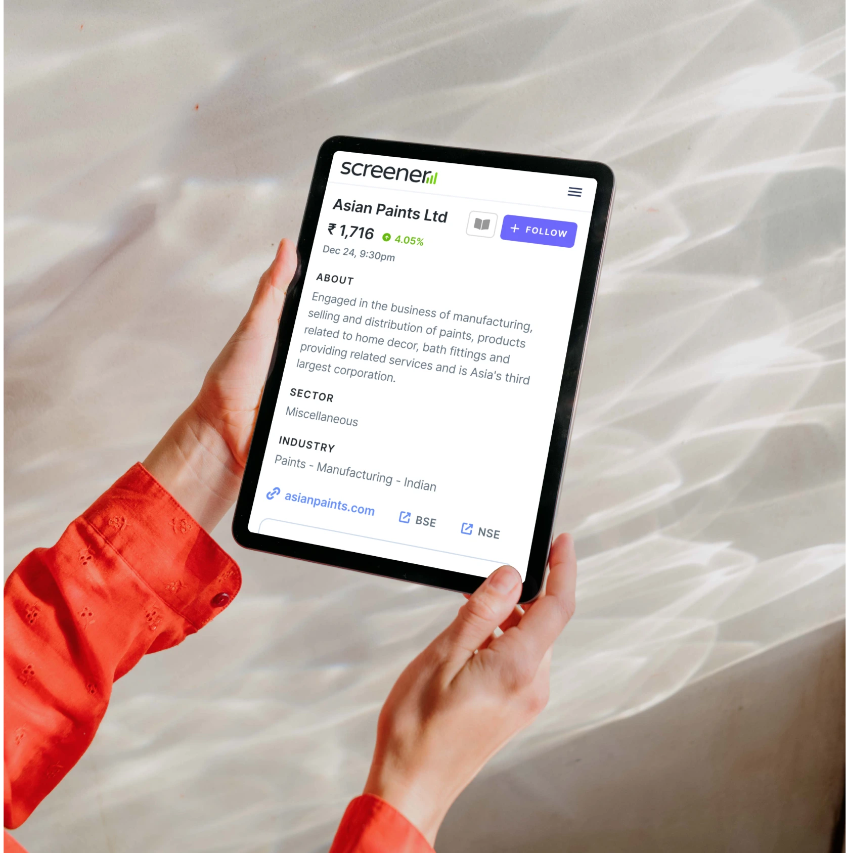
Mobile Responsiveness: The platform wasn’t optimized for mobile devices, affecting usability on-the-go.

The Goals
Simplify User Experience: Make the platform more approachable for new users without compromising advanced functionalities.
Enhance Customization: Allow users to personalize their experience.
Improve Mobile Usability: Ensure seamless access across devices.
The Methodologies
User Interviews: Conducted sessions with both novice and experienced investors to understand their pain points and needs.
Surveys: Gathered quantitative data on user preferences and behaviors.
Usability Testing: Observed users interacting with the platform to identify friction points.

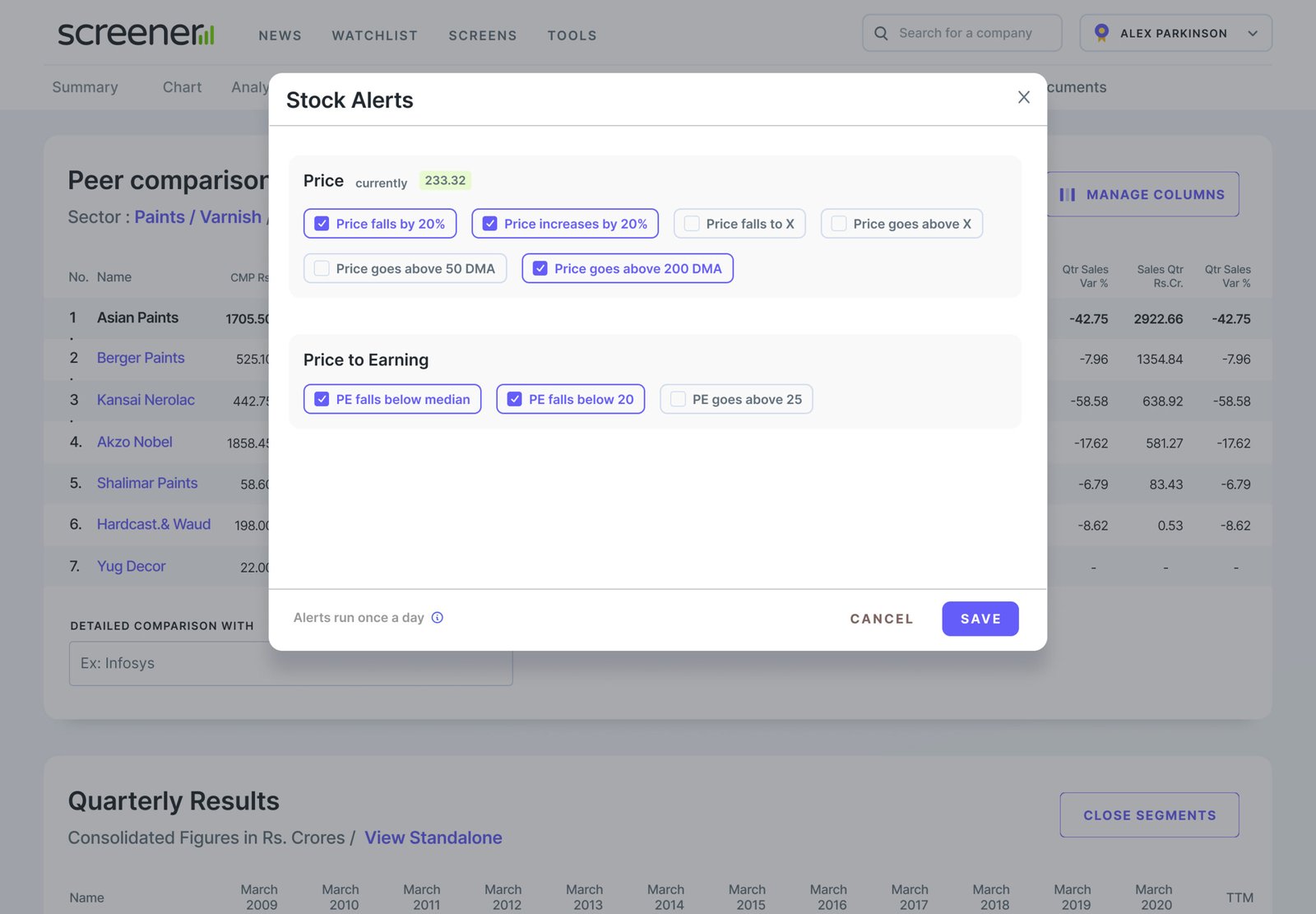
Key Interface Components
To ensure a cohesive and intuitive user experience across the Screener.in platform, I designed a modular component system that prioritizes clarity, accessibility, and performance. Each element is crafted to support the platform’s data-rich environment while staying out of the way of the investor’s decision-making process.
The top navigation bar serves as the central access point for global search, quick links, and user account actions. It remains persistent across all views to support quick exploration and context switching.
The redesigned Screener.in logo modernizes the brand while retaining its analytical DNA. It balances professionalism with approachability aimed at both retail investors and finance professionals.
The collapsible side menu organizes the platform’s growing features without overwhelming the user. It improves navigation by grouping core sections logically (e.g., Dashboard, Watchlist, Screens, Portfolios).
A major focus was enhancing the readability and usability of complex financial data tables. Each table is designed with finance-first principles while introducing UX enhancements for interactivity.